From the blockchain to Basics
Bitcoin at scale — making it make sense.
What it is
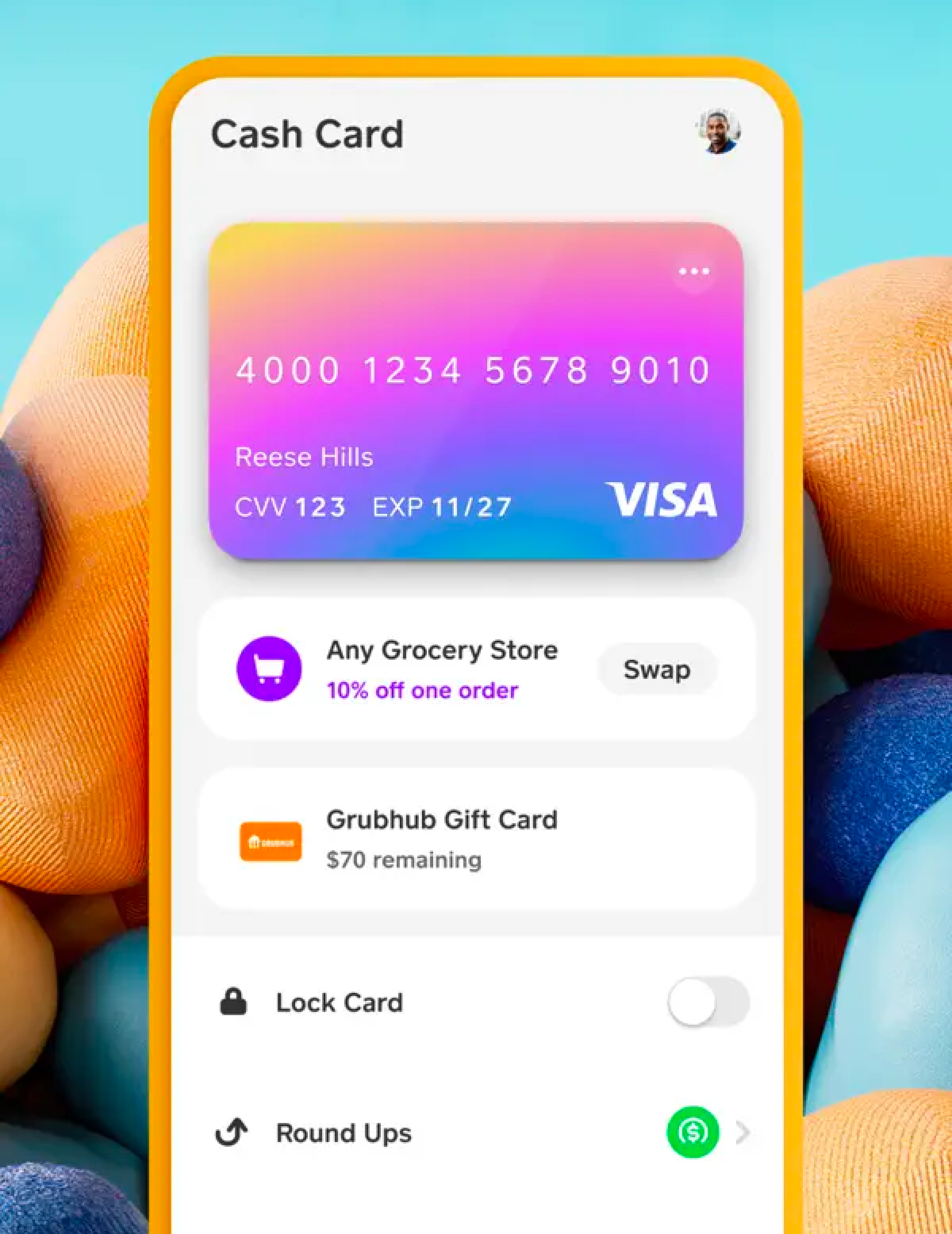
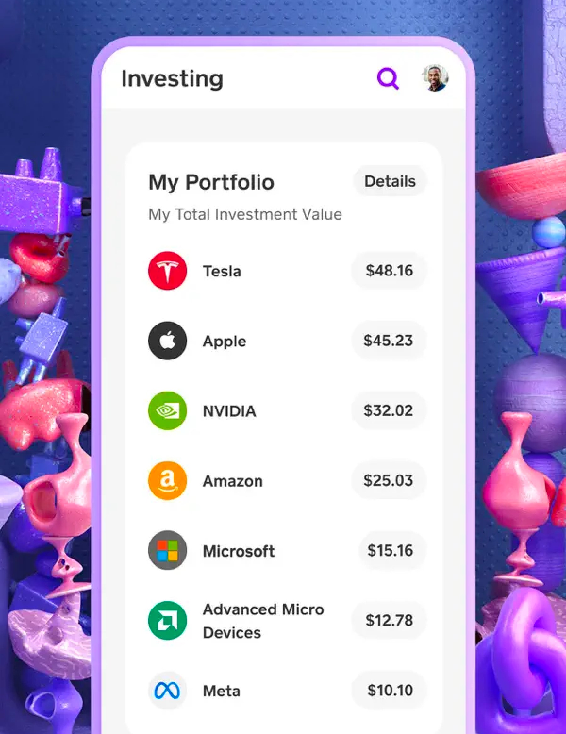
Cash App had already made it easy to buy Bitcoin. The harder question: how do you make it meaningful to people who don't think of themselves as crypto people? I led product design for Cash App's Bitcoin team at Block.
Why it exists
Bitcoin's most passionate believers saw it as a movement. Most Cash App users saw it as something they bought once and watched go up or down. The product didn't bridge the two. Comprehension follows relevance — if you explain something at the moment it matters, people learn. That was the design bet.
How it's built
How do you make Bitcoin meaningful to people who don't see themselves as crypto people?
“Cash App had already made it easy to buy Bitcoin. The harder problem was the gap between currency and culture.”
The setup
I led product design for Cash App's Bitcoin team at Block from 2021 to 2023. By the time I joined, buying Bitcoin in Cash App was a few taps. The team had nailed the transaction. What it hadn't nailed was the meaning. Most people who bought Bitcoin in Cash App bought it once, watched the price for a few days, and stopped. The most passionate believers saw Bitcoin as a movement. The product didn't bridge the two.
The three pieces
There were three things to get right, and they nested inside each other: a way for people to learn at the moment that learning would land (Basics), a way for them to take real ownership of what they bought (Self-Custody), and a way for them to actually use it as money (Lightning). None of them work without the first one.
Comprehension is a design surface.
“People learn when they have a reason to. Where and when you explain something matters as much as what you say.”
The shift
Most financial education inside apps is a thing you tap into when you don't know what you're doing. It lives in a help section. It is, by design, easy to ignore. We inverted it. Basics treats education as a moment in the product flow, not a destination. A short explainer surfaces at the place in the experience where the concept is actually relevant — when you're about to send Bitcoin, when the price moves, when you encounter a fee for the first time.
What it looks like
Each Basics piece is short. Two or three sentences, sometimes a single illustration. No quizzes, no progress bars, no streaks. The point is comprehension at the moment of relevance, not engagement metrics. The writing pass mattered as much as the design pass. Every word was tested for whether someone who'd never thought about Bitcoin could read it on their phone, on the bus, and feel one notch smarter without feeling lectured.
Why it worked
Basics didn't try to make people Bitcoin experts. It tried to make them feel oriented. That's a different design problem and a smaller one — and getting it right was the unlock for everything that came after. If people understand what they're holding, they're willing to do more with it. Self-custody and Lightning would have been impossible to ship without Basics shipping first.
From Cash App holds it to you hold it.
The challenge
Self-custody is the moment Bitcoin actually starts to mean something. It's also where most users freeze. The phrase "private key" alone is enough to put people off. The fear of losing access to your own money is the strongest possible disincentive.
The approach
Progressive disclosure was the whole game. Don't show someone the full surface area of self-custody on day one. Get them one step further than they were. Give them guardrails that build confidence instead of guardrails that create anxiety. We designed the flow so that the feeling at every step was "I understand what just happened" — not "I hope I did that right."
Make the happy path invisible.
The premise
Lightning Network is technically different from on-chain Bitcoin in ways most users don't need to understand. Channels, liquidity, routing — none of that should ever land on a user's screen unless something goes wrong. The goal was to make Lightning send and receive feel as fast and as simple as Cash App's existing person-to-person flow. The technology was new; the experience couldn't feel new.
When complexity has to surface
Sometimes Lightning fails in ways on-chain doesn't. A payment can't route. A channel runs out of inbound liquidity. When that happens, the design choice was honesty over hiding. Tell the user in plain language what didn't work and what to do instead. That's the rule the whole Bitcoin team operated by: invisible when it can be, honest when it can't.
The hardest UX problems look simple but carry enormous stakes.
“Helping someone understand what they're holding — and feel safe holding it — while staying out of the way of the people who already know. That's the work.”
The thread
It took me a few years to see it, but the design problem at Cash App is the same one I'm working on now. Different surface, same shape. With Bitcoin, the question was: how do you give someone real power over something they don't fully understand, without breaking their trust? With vyb, the question is exactly that, except the thing they're holding is an AI that can write code, send email, and act on their behalf.
Why I left
I left Cash App in 2023 to build Stemstr, then Nectar, then vyb. Each one was an attempt to take the same instinct — meet people where they are, get them one step further, never lecture — and apply it to a smaller, weirder, more honest problem. The work I did on Bitcoin is the work I'm still doing.